This is the triangle of exposure. Exposure is made up of three separate settings on the camera iso, shutter speed and aperture. For activity 5, 6 and 7 we had to experiment with these 3 setting on the camera.
The first activity was to test what kind of shots you get when you use all of the different iso settings.

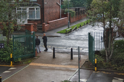
The first photo taken was at 100 iso and you can tell that the picture is a bit darker than it actually was outside.

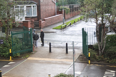
This photo was taken at 400 iso and this one was the closet to the natural colour of what it was outside.

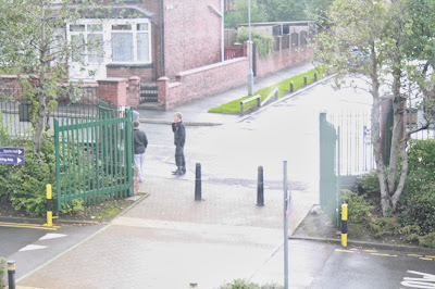
This photo was take 1600 iso and the picture looks very bright and over exposed.
The iso setting depends on the weather and if it is very overcast you would use a high iso and if it was bright outside you would use a low iso.
Activity 6 was to use the shutter speed and use all the different settings available on the camera.
The shutter speed is used for how long you want to take a picture for. So if you use the lowest shutter speed which is 1/4 the picture will be really bright because the shutter is open for longer. The highest shutter speed is 1/4,000 the picture will be really dark because it isn't letting much light in because the shutter closes quicker.
1/4
1/5
1/10
1/20
1/40
1/50
1/60
1/80
1/100
1/125
1/160
1/200
1/250
1/320
1/400
1/500
1/640
1/800
1/1,000
1/1,600
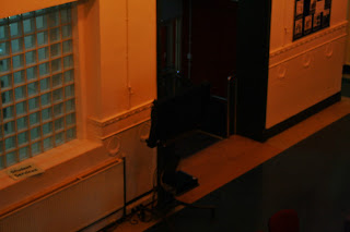
When I took the the picture on 1/6,000 you couldn't see anything because it wasn't letting enough light through so that was the last picture I took.
Activity 7 was to use the aperture (F Stop) setting on the camera and you use all of them until you can no longer see the image.
Aperture is the opening a closing of the lense smaller the opening the more it is on focused on a specific part of something but if it is open more everything will be in focus, but the picture gets darker.
F Stop 4
F Stop 4.5
F Stop 5
F Stop 5.6
F Stop 6.3
F Stop 7.1
F Stop 8
F Stop 9
F Stop 10
F Stop 11
F Stop 13
F Stop 14
F Stop 16
F Stop 18
F Stop 20
As the aperture is changed to a higher number you can tell that it gets darker and darker considering at what it looked at F Stop 4 and then at F Stop 20 you can barely see the image at all.
The fourth activity we did was to go out out and take picture of lines, so I went out and tried to take pictures of horizontal, vertical and diagonal lines.
 Here are some pictures of a gate behind a police station and because it has raining earlier in the morning there was some raindrops still on there, so I thought it would make a good picture. The gates are horizontal so it looks like lines. I like on in the background how the car park is blurred out, this is because the camera is mainly focusing on the gate and the raindrop alone and nothing else. In another picture the was some more raindrops but it looked a little out of focus.
This image is from a climbing frame from in a park you can see a big vertical line right down the middle of the wood and then you see can see lots of other vertical lines next to them. This is because of the way the wood has been made. I like this because the main focus is the dip in the wood and then the sub focus is the lines that are just there from the nature of the wood.
This photo again is in the park and I would class it as curves because all the rope is twisted together to make it stronger. The rope is the main focus of the photo you can tell because the ground is blurred out to make it the focus. The lighting is natural because we are outdoors and it isn't dark so everything is really clear.
On the fourth day the activity was to go out and take pictures of lines and pictures which involve different type of angles.
There is so many sort of health and safety precautions that you have to think about when proceeding with photography. You have to think about if you are at a outside location or if you are in a studio, you have to think about photography permissions aswell.
Location
The photographer should have public liability insurance from their current employer this covers you if you harm someone from the public or vice versa.
A photographer and his assistant should make sure they have motor vehicle insurance if they are going out for a job, but the insurance will only cover them for business use.
The photographer or assistant should carry out a risk assessment especially in the areas that the photographer wants to take pictures.
You should ensure that the location has sufficient fire precautions and have signs in place.
The photographer should share health and safety concerns with his assistant and and the location management if necessary.
All equipment must be tested professionally before going out for a job to ensure that they are fully working and that there will be no problems with them once they get to location.
All of the employees should be trained to use the equipment safely and properly.
Should take precautions to decrease any problems that have been identified relating to safety on the job and to other employees or pedestrians at the location.
