Wednesday, 2 July 2014

Nature Evalauation

This is 3rd and final photography exhibit and I wanted to capture a lot of nature around the area that a live.  The easiest places to capture images of nature are Hyde Park and Werneth Lowe.  


This image was taken in Hyde Park and the reason I like this image is because I like how the sun shines through the leaves on the trees and it really stands out.  There isn't really a main focus with this image because the subject is nature and nature is everywhere is this picture. The rule of thirds works well with this image and because you have the tree on the left, then the middle with the light and the the right tree.  The only thing that I did when I edited was that I turned down the brightness because the sun was to bright so I turned it down.  I should off cropped the image on both sides so that the extra trees weren't in it that would of made it look better.  I don't like how you can see fences in the photo and if I was to take the picture again I would try to get a less of the fences as possible.


This is the 2nd image that I put into the exhibit, I like this image because of the singular mushroom on it's own and it stood out as soon as I saw it.  All the leaves were naturally already there, but the leaf on the left looks like it is falling down to the floor.  I used manual focus to try and just focus on the mushroom because I wanted that to be the main focus.  What also stands out is the moss around the bottom of the trees.  I turned the flash on when taking this picture because I took one similar without the flash and it looked to dark so I took it again with the flash and it looked a lot better than the first attempt.  When I edited the photo all I really did was scale it up the make the image bigger.  If I was to do the photo again I would maybe make all the photo in focus instead of just having the mushroom in focus.


This is the 3rd and final picture that I used in the nature exhibit.  The thing I like about this picture is that how just one of the leaves is in focus instead of them all being in focus.  I like how one thing is just in focus because it then makes the subject in focus the main focus and in every image you should have a main focus.  I like how much detail is in the rain drops because when you see rain on a leaf it just look like a wet leaf but by doing this you can see the rain drops individually and it has a lot of detail which I like.  This photo was originally landscape and worked well with the rule of thirds but I then liked how the image was portrait and then the rule of thirds didn't really work.  But I still used the image because it stood out to me and I enjoyed it.  As I just mentioned when I edited it changed it from landscape to portrait and that was the only editing that I did to this image.  If I was to go back to  taking this picture maybe I could of taken I different range of photos including water on flowers or with a water feature that would of looked really good and would of stayed with one topic.


When I finished this exhibit I was happy with what I had done it wasn't as good as my other two exhibits but it was satisfactory and I still enjoyed talking image in the woods.


Street Life Evaluation

My next exhibit is my Street Life which I think is my best exhibit out of the 3 that I did.  Some people may call in documentary but I gave it another name so that I stood out more and that because it is the street life of Manchester City Centre and no matter what you will see people like this no matter what city you are in because it's just the way life is and people are trying to earn money for there families.  For each image that I chose there is something different to it.


This is the first image I chose for my Street Life exhibit, I chose this image because who ever is under that suit isn't doing it for themselves he is doing it to raise money for charity no matter how hot it maybe in that suit he is doing it for others in need of the money.  I like how the fact you can see the shadow of Pudsey the Bear on the wall and even though the everything around him is in black and white you still know that it is a sunny day, you can see a bank just behind and it makes the image stand out because you know that he is in a populated area because banks are in populated areas so people can get money and then maybe he could raise more money for charity if he is in a populated area.  Once I got a back to editing the image the image was slanted so by rotating it, it made it straight and then by scaling in it made it bigger.  With all these Street Life images I decided that I wanted all the backgrounds black and white and then I wanted the main focus in colour so that they stood out more.  If I could go back to taking this image to make it better I think capturing somebody putting money into the collection I think that it would get the message across a lot more that helping others is important.


Here is the 2nd picture that I used and it is an image of a man working for the MEN (Manchester Evening News) this may not be the best job in the world for this man, but these days it is very hard to find a job, so he probably did his best and found this to earn some money.  What I like about this image is how he is stood there with a newspaper and he looks like he is looking directly into the camera.  Also I like how I managed to capture other people into the image because otherwise if it was him on his own and nobody walking past it would look like the image was set up which I didn't want it to look like that.  There are lots of shadows in the image coming off the people and then coming of the newspaper stand showing that it was a sunny day and sun shows many emotions that it could be a happy day.  I tried my best to use the rule of thirds for all the images as best as I could so that there was something in each third and for this one you have the man selling the papers in the middle then on the left you have the women walking past and then on the right you have the newspaper stand.  If I was to come back to this image I would sure there was a little less head space and zoom in a little more to capture the facial expression of the main focus.

This is my 3rd & 4th picture from my exhibit and they are both very similar and they are what you call buskers, they guy from from the top is performing the saxophone and the guy below is dressed up as Predator, they are both trying to earn money for themselves because maybe the are unemployed and can't find a secure job so they find there own ways of making money.  I like how they are both are outside of shops so that they are easily noticed by customers and the customers then

might give them some change.  I wanted the message from these two images to come across as how life isn't so easy for some people and that you shouldn't take things that you have in life for granted because these people may not have that much in life.  You can now tell that it is later in the day or there was a quick change in weather because there are now no shadows unlike the previous images.  Both images were edited so that they were straight as possible and using the rule of thirds.  If I was to go back to taking these pictures I would do 2 things on the top one picture I would zoom in more on him playing the sax and eliminate some of the head space and then for both of them I would of liked to capture and pedestrian giving them some money showing people that giving them some change isn't a bad thing and it could eventually end up helping these people out. 


This is my 5th and final image that I used on my Street Life exhibit and from all the other images this one differs because this guy look like he is doing well for himself it looks like this is his own business and he picked a good spot to place it in the middle of Manchester because it is always busy and people may not won't to pay food court prices.  What I like in this picture is how people are actually buying food from there and this is what I wanted to do with all of the images is somebody to contribute and I got that with this picture.  The owner even has a charity bucket on his stall and what he probably does if some lets him keep the change he will put it in the charity bucket and this is what life should be like not keeping everything for yourself and helping out others.  The facial expression of the owner is that he looks really happy and that maybe because he enjoys what he is doing or he might be having a good conversation with the customers.  I was quite for away for this image but I zoomed in and managed to capture a lot.  This image was really slanted when I came to editing it so I had to do a lot of rotating so make it straight and look presentable.  This is the only image that I wouldn't want to change anything because I thing it is a really good photo. 


After completing these image I was highly satisfied with what I produced and couldn't be happier with this exhibit.  Because it had a lot meaning behind it and it also told a little story this is why it was my best exhibit out of the 3.    


Architecture Evalauation

I really enjoyed taking photos of the architecture around Manchester because there are so many different types of buildings but I chose to mainly focus on the newer looking buildings and then did the odd older looking building to compare how they differ over the years.  I ended up selecting 3 images to exhibit and I am going to evaluate all 3 of them.


This is the first picture that I decided to put on my exhibit, I really like this image just because it is an unusual looking building and you don't see a building like this every single day.  This building was directly in the view of the sun so you can see a lot of reflections coming off the building because of the sun which makes the building look a lot better because if it was a dull day the building would look ugly.  There are no clouds in shot when I took this picture which makes the building more of the main focus because there is nothing else you can see.  When I went back I then edited this picture and originally it was a bit slanted so I used the rule of thirds and then I rotated the image until it look as straight as possible.  To improve this image I would eliminate some more of the sky so that then there would be more detail in the building.  Also if I was to get a worm's eye view of the building I think it would look really good.


The next image I selected was this image of a church and as you can see there is a building behind it which is more of a newer build and I like how that the church makes the building behind look really scruffy and it makes  it look like a poor piece of architecture, it goes to show that old building today still look nice just because they are a piece of history.  Also you can see the tree in front of both of the buildings I could of easily of picked another picture without the tree in it but I liked this picture more because you can see a bit of the natural surrounding because no matter where you go there will be nature around architecture.  You can see that its a clear day but even if it wasn't a clear day and it was dull the image would still look good because the colouring of the church is dull and it would match.  Using the rule of thirds again once I edited it to make sure that the image looked perfect, with this image to I added an effect to it and it was a grain effect you can only really see the grain effect when you look at the sky.  If I was to improve this image I would go back and I would like to get more of the church in the image to make it look like the church is the more dominant of the two building that you can see.


This was the 3rd and final image that I added to my architecture exhibit and I went back to the view of a newer looking building and like the first image the majority of the building is made from glass.  You see a lot of newer looking building made from glass obviously it's not just glass it will need metal to support it but a lot of the metal will be hidden.  This building is of a store and it is a well known store and if the building looks unusual then people tend to remember it more because it stands out.  There are two other building next to the main focus and it looks like the 2 other building are holding up the main focus.  Again it is a clear sunny day and because it is sunny and the building is made from glass you can see reflections you can see on the left side the sun  is shinning off it and then it you look closely you can see some of the building structure on the inside on the glass.  If I was to come back and do this image again I would eliminate the clouds but I would keep a lot of the sky in it because it stands out more than it does in the first image because it is a slimmer building.  I went up close to the building and got a worms eye view of it, it would look good because it is a rounded building and it would look unusual and look like something you haven't seen before and when doing photography you want unusual because it you just take pictures of bog standard things it would look boring and people wouldn't look at them the same.


After I had exhibited my architecture I was happy with the 3 images I selected and I think they were the best 3 that I took and couldn't be any prouder of my work I put in 100% and the only things that would make them better is the improvements that I mentioned above.    


Wednesday, 25 June 2014

Arnold Newman (Documentary)

Arnold Newman born in Manattan, New York on March 13 1918.  Arnold Newman is well known for his environmental portraits of artists and politicians, also know for his carefully composed abstract still life images.  He found his vision in the empathy he felt for artists and their work, he photographed many personalities including John.F Kennedy, Harry S Truman, Pablo Picasso, Ronald Reagan and Audrey Hepburn.  Newman is credited with being the first photographer to use so called environmental portrait, in which the photographer places the subject in a carefully controlled setting to capture the essence of the individuals life and work.  Newman used the subjects in familiar surrounding so artists in a recording studio or stage or politician in their office or representative  building.  Newman didn't often use colour, his main style was black and white.  His best know colour image was of former Nazi slave labor boss Alfied Krupp in one of Krupp's factories.  In 1946 when he moved back to New York City he opened Arnold Newman Studios and worked freelance photography for Fortune, Life and, Newsweek. 


This is a picture that Arnold Newman took of Ronal Reagan when he was President of the United States of America.  Right from the off you can tell that this is an Arnold Newman because of the background he is using because he likes to take pictures of people whilst in there profession and this is Ronald Reagan in the White House where he will have spent a lot of his time whilst he was president.  The facial expression Reagan is using look kind of smug like he is one of very few people who have had the privilege of working in that room also he looks proud to be in power of the country.  The lighting in this room is relatively bright and if think that when you think of the White House that you think that inside it should always look bright and clean which in this picture is does because it is considered as a great place and it is highly recognised across the globe so it needs to like presentable.  I think that Newman is stood a bit of a distance away from Reagan because you can see that there is a lot of headroom but that is because he wanted a wide shot so that he can get the majority of the room in shot so you know where he is.  Reagan is dressed very smartly and people expect him to because he is president but the picture would look good as well in something less casual because behind close doors I don't think he will wear a suit all the time because it can be uncomfortable so the image would of looked good if they had casual clothes on to see how the president dresses on his down time.   


Friday, 20 June 2014

Lee Friedlander (Documentary)


Lee Friedlander in Aberdeen, Washington on July 14 1934.  Friedlander studied photography at the Art Center College of Design in Pasadena, Calafornia.  In 1956 he moved to New York CIty where he photographed jazz singers for there record covers.  Working mostly  with Leica 35mm cameras and black and white film, Friedlander main style focued on social landscape.  His photographs used detached images images in urban life, store-reflections, structures framed by fences, posters and signs all combining to capture the look of modern life.  In 1963 he had his first solo exhibition at the International Musuem of Photography at George  Eastman House.  Freidlander now works with medium format cameras like Hasselblad Superwide.  Freidlander suffered with arthritis with made it hard for him to carry on with his photography so with the little he did he photographed his surrounding as much as possible.  His book 'Stems'  reflects his around the time of his knee replacment surgery and says that his limbs remind him of plant stems.  These images display textue which were not a feature of his earlier work.


You can tell straight away that this is a Friedlander images because of the style because he likes to capture images of everyday life and this is what this image is, it looks like a cafe and you can see the two people in the window and they look completely oblivious that they are being photographed, another style you can tell is the reflection of the other shops in the window.  Even though the image is black and white you can tell that it is natural lighting because he is outdoors and you can see the reflections.  The image look like it was taken across the other side of the road and then used a zoom lens to capture the facial expression. The older man looks like the owns the shop because he is dressed professionally and he may be looking outside to see how nice it is or he could be looking to see if any customers are coming, then the kid could be a customer or he could be a relative of the owner and he looks bored.  You see the Coca Cola advert in the window and its shows how long Coca Cola has been around and how widely recognised it was even then. 


Thursday, 5 June 2014

Robert Capa (Documentary)


Robert Capa born in Budapest, Hunagary on October 22nd 1913.  Capa was most well known for his photography which documented on several wars.  Capa originally wanted to be a writer, but he found some photography work in Berlin and then he learned to love the art of photography.  In 1933 he moved from Germany to France because of the rise of Nazism and persecution of jewish journalists and photographers and found it hard to get freelance work.  Arounnd this time he changed his name from Endre Friedmann to Robert Capa, Capa was his nickname in school and it was more American sounding and it was similar to American film director Frank Capra.  He found it easier to sell more pictures under his new name.  Capa's first published photograph was of Leon Trotsky making a speech in Copenhagenon The Meaning of Russian Revolution in 1932.  In 1947 Capa co founded Magnum Photos in Paris with David Seymour, Henri Cartier Bresson, George Rodger and William Vandivert, Magnum Photos was the first cooperative agency for worldwide freelance photographers.  The 5 wars he photographed were the Spanish Civil War, the Second Sino-Japanese War, World War II across europe, the 1948 Arab-Israeli War and the First Indochina War.  He documented the course of World War II in London, North Africa, Italy, the Battle of Normandy on Omaha Beach and the liberation of Paris.


Robert Capa most famous image named 'The Falling Soldier' was captured in the Spanish Civil War.  The soldier has just been fatally shot by the enemy and is collapsing backwards  and the gun is falling out of his hand.  In the image you can see a lot of landscape even in the distance, there seems be a lot of clouds in the sky and they seem to be grey so it must have been quite a dull day.  There wouldn't of been any adding lighting because he would of wanted to capture the image in natural lighting because it not like it's a image taken  on a set it's a man doing his job in the Spanish Civil War.  Capa would of been relatively close to the soldier that had just been shot.  The picture probably was intended to be of a soldier being shot and killed, Capa probably just wanted an image of a regular soldier doing his job but just at the time he was taking the picture the soldier had been shot wish was unfortunate but it also shows what actually happens in wars and it wasn't pretty.  There isn't really any facial expression you can only see one side of his face and his eyes and mouth are closed so maybe the soldier had died on impact of the shot.  You don't see many pictures like this you either see a image of a soldier that is doing his job or that is already on the ground but he is captured an image where he has only just literally been hit by the bullet.    


Herb Ritts (Portrait)


Herb Ritts born in Los Angeles, Calfornian on Auguest 13th 1952.  Ritts first started off working in the family furniture buisness, until he moved to the east coast to study at Bard College in New York where he earned his major in economics and art history.  It wasn't until he moved back to Los Angeles that he became interestd in photography where he and his friend Richard Gere who at the time wasn't aswell known as an actors as he is today, decided to take some photographs in front of an old jacked up Buick.  The photographs gained Ritts some coverage and he begin to think more seriously about getting into the photography business.  He photographed Brook Sheilds for the cover of October 12th 1981 cover of Elle, he then also photographed Olivia Newton John for her physical album in 1981.  Five years later he used the same pose for Madonna and her True Blue release in 1986.  Over the years he worked for several magazine and Fashion designers icluding Esquire, GQ, Vanity Fair, Rolling Stone, Giorgio Armani, Ralph Lauren, Lacoste, Levi's plus many more.  He took many photos of celebrites over the years including the likes of Cindy Crawford, Michael Jordan, Ronald Reagan, Tina Turner, Michael Jackson, Stephen Hawking plus many more.


This image of Michael Jordan is Ritts style of photography he loves to use black and white images and black and white images for portrait look better than they do in colour, they stand out more because they are different.  The facial expression he has is a kind of seriousness and because he is holding the basketball in his hands that he is serious about the game of basketball and that the loves the game, it could also be taken that he is being smug because he is known as the best basketball player in the world.  Because it's black and white you can't really tell about the lighting but you can see a little bit of light on the middle of his face because in the middle of his face its lighter than either side and you can see a little bit  of light behind his back through through the arches of his arms because of the way he is holding the ball.  The way the photo is taken Ritts must be quite close to the subject, there is no head space and the image seems to be quite full apart from above his shoulders they could of taken the picture on a basketball court filling the picture in and making look like he is  in his natural surrounding.  


Oliverio Toscani (Portrait/Advertising)


Oliverio Toscani born in 1942 in Milan, Italy. Toscani wanted to take up photography because he wanted to follow in his fathers foot steps Fedele Toscani who used to be a photoreporter for the Italian newspaper Corriere della Sera. After Toscani gained his diploma at Kunstgewerbeschule in Zurich he went onto working with several magazines including, Elle, Vogue, L'Uomo and Harpers Bazaar. In 1982 he started working for Benetton where some of his campaign work made controversy across the globe. In the early 1990's he co founded the magazine Colors with the company Benneton. He carried on working for Benneton until 2000. Once again in 2005 Toscani caused controversy with campaign ads with men's clothing brand Ra-Re which shows men engaging in homosexual behaviour and then again in 2007 a campaign on anorexia which has controversial because of the shocking photography of an emaciated women (Isabella Caro).


This was Oliverio Toscani first controversial image and it was of David Kirby on his deathbed dying of AIDS. The image was used in Life magazine as a campaign to prevent AIDS and the Kirby family gave permission for Life magazine to use it. You can tell why it was controversial because it isn't a very nice image, but it sends across a message to everyone to prevent people form spreading the horrible disease around. The lighting in the hospital will just be natural lighting because they wouldn't of set anything up because the family would of wanted some privacy. All the family is obviously grieving the loss of a family member but each member of the family has a different facial expression the father of David Kirby looks distraught in that he is about to lose his son, but then his mother looks like she is trying to ignore what is going on around her so that then she doesn't have to deal with it and then his sister look like she doesn't have a clue what is going and has a sense of shock on her face. The main subject is David Kirby because he is the one that is dying but then there is the other subject of the family grieving. Toscani who took the picture would have had to be standing a bit of distance away to give the family space that they need so he would have had to use zoom to see the expressions of the family.


David Bailey (Portrait)


David Bailey born in Leytonstone, England on 2nd January 1938.  David Bailey is well known for his famous portrait work.  In 1958 Bailey was demobbed and was determined to pursue a career in photography, he bought a Canon rangefinder camera.  Unable to fold a place at London College of Painting because of how much school he missed as a child he became the second assisstant to David Ollins, in Charrlotte Mews.  He earned 3 pound and 10 shillings and acted as studios dogsbody.  In 1959 Bailey became photographic assisstant at the John French Studio and then in May 1960, he was a photographer for John Cole's Studio Five before being contracted as a fashion photographer for Bristish Vogue.  Since 1966 Bailey has also directed several television commercials and documentaries, from 1968 to 1971 he directed and produced TV documentaries such as Beaton, Warhol and Visconti.  In 1985 Bailey photographed the stars that took part in the Live Aid concert.

This photo is of the Kray twins London's most notorious criminals of the 1960's and David Bailey photographed them before they got sentenced to prison for murder in 1969.  In this photo you can see that both of the man are the subject and they are made more of the subject because it is just a plain white background so that the guys stand out more.  The way  they are both looking, its like they are hard man and they have no care in the world for the things that they have done.  It is a close up photo so Bailey would of been standing relatively close to the subjects and standing closer captures more detail.  The photo was obviously taken before they were sent to prison in 1969 but the photo is kind of in the style of a mug shot so it's like David Bailey knew they would go to prison and it is a pre mugshot before they actually got sent down.  This was a famous photo for David Bailey he claims that he made the Kray twins famous, but also the pose in the image has been used by other photographers using other people.  


Tuesday, 3 June 2014

Mario Sorrenti (Fashion)


Mario Sorrenti born 24th October 1971 in Naples, Italy.  Sorrenti moved to New York City in 1981 at the age of just 10.  He is the son of New York based advertiser Francesca Sorrenti, Mario is also the older brother of fashion photographer Davide Sorrenti.  Sorrenti is most known for photo spreads of nude models in pages of Vogue and Harper's Bazaar.  He has had exhibitions in London, Monaco, New York and Paris Museums of Modern Art.  He has directed several Calvin Klein adverts over the years.  He has also previously worked with Lancome, Paco Robanne, Benetton and Pirelli Calendar 2012.  He is currently under contract with the agency Art Partner.  So as soon as Art Partner get contacted about a shoot they will send out Sorrenti to the shoot.


In this photo Iggy Pop and straight away you know that you can tell it is a Sorrenti photo because all across the image you can see Art Partner and that is the agency he works for.  The lighting in this picture look natural but you can tell the light is coming from the subjects right hand side.  You can tell that Iggy Pop is the main focus in this image because the background behind him isn't in focus and either is the wine bottle in front of him.  Make him the focus draws the people into think what he has been doing at the table, you can tell that he has been eating but his facial expression makes him look like he is upset or depressed or maybe he is just thinking about something but you can't work it out because he is sat on his own if there was something else in the photo that would could help the audience determine what is up with him, put maybe that is the whole point to keep the audience guessing.  The shot is a mid shot so he must be about 6 feet away but also the angle isn't looking straight on the camera is looking across from his left side and also the camera seems to be looking slightly down on him making him look like he is worthless, so maybe this man is poor and that's the reason he looks depressed.  This isn't Sorrenti usual style he mainly uses the sexy look same to Richardson but all photographers will go out of the comfort zone to improve there skills and make there style have a wider range.  


Mario Testino (Fashion)


Mario Testino born October 30, 1954 in Lima, Peru. In 1976 Testino moved to London, England to study Photography, without much money he funded himself by working as a waiter. He dyed his hair pink to help him get noticed as a photographer. 1982 he permanently moved to London. Testino had wrote fashion stories for Vogue, V, Gucci and Vanity. Celebrity subjects have most famously included Diana, Princess of Wales and her sons. Testino has take photos of many actresses, performers and models including Kristen Stewart, Cameron Diaz, Julia Roberts Meg Ryan, Madonna, Britney Spears, Lady Gaga, Kate Moss, Elizabeth Hurley etc. Testino also enjoys photographing the Royal family. He has become one of the world's most well known and celebrated fashion photographers. He has contributed to the imagery to some of the most well known fashion houses including Burberry, Gucci, Calvin Klein, Versace, D&G and Estee Lauder. Testino has received royal recommendations from Prince of Wales, Prince Harry, Duke of Kent, Prince Nikolaos of Greece, Prince Willem-Alexander and Maxima of the Netherlands and many more. In 2011 he was presented with an Honorary Fellowship by the Royal Photographic Society and most recently on January 14th 2014 he received an OBE by the UK Culture Minister Ed Vaizey.


This image I have taken isn't a studio shoot, it is a location shoot and by the looks of the image it seems to look like they have just come back in from a night out and they have walked back into a really posh hotel. Even though you can just see a bit of the foyer you can tell that it is a nice hotel. The way they are dressed you can tell that they are upper class because the way they are dressed and they both have a nice comfortable life. The way the lighting is set it doesn't look like the lighting is specifically on the subjects it looks like its lit just by standard lights like there would be in a hotel. Even though there is two people in the photo its seems that by the women walking a jaguar seem to be more of the main focus because it's not everyday you see someone walking a jaguar and its makes the photo stand out. The facial expressions they are pulling are both different for the male he is looking at the female thinking that she is looking fine this evening and it's like he is staring at her. Then the female has an expression that she is walking with confidence and she looks a bit cocky because she knows the guy is looking at her and she knows why he is looking because she is looking good.  He must have been a bit of a distance away because there is a lot in the shot so to get all of it in you have to bee a bit away but not to far away. You can't automatically tell this is a Testino because he doesn't have a specific style but then there is a celebrity in it with Scarlett Johansson and he likes to photograph celebrities. The only way you can tell it that it could be a Testino shoot because he adds a bit of class to his shoots and likes people to look classy and presentable.


Monday, 2 June 2014

Terry Richardson (Fashion)

Terry Richardson born August 14th 1965 in New York City, New York.  He is the son of Bob Richardson formerly a fashion photographer.  He originally didn't want to be a photographer he wanted to be a punk rock musician, he played bass guitar in the punk rock band The Invisible Government for 4 years.  Terry Richardson's mother gave him his first snapshot camera in 1982, he used it to document his life and the punk rock scene in Ojai, California.  In 1992 Richardson quit his punk rock band and moved from Ojai, California to New York City, New York.  He began shooting scene of young people partying and New York City's nightlife.  Richardson made his big break when he was living in New York City he published fashion photos for the first time in magazine Vibe in 1994.  He did an advertising campaign in 1995 for fashion designer Katharine Hamnett spring 1995 collection.  Following the advertising campaign he moved to London, England where he worked for magazines such as The Face, i-D and Arena.  Throughout Richardson's career he has shot campaigns, fashion brands and designers such as Marc Jacobs, Aldo, Supreme, Sisley, Tom Ford and Yves Saint Laurent.  He has done work for several magazine including Rolling Stone, Vogue, Vanity Fair and GQ along with a lot  more.  Richardson has a certain style of work and a lot of recurring themes, notably for putting high profile celebrities in mundane situations and photographing them using traditionally pedestrian methods, he also explores the ideas of sexuality.  Richardson's main trait is the plane white background and he also takes pictures with the person he is photographing.  Also known for his non sexual portraits he has taken non sexual photos of politicians and actors such as Samuel L Jackson, Sharon Stone, Gwyneth Paltrow, ASAP Rocky, Pharrell Williams, Jon Bon Jovi, Daft Punk, LeBron James and Barack Obama.


Here is one of Terry Richardson's  photos and the subject being 'Breaking Bad' star Aaron Paul and straight away you can tell that it is a Terry Richardson photo because of the white background he loves to use, the main reason he uses the white background so that the main focus is only the subject.  The lighting of this photo is coming from the subject's left hand side and you can tell this because of how bright it is on the left hand side and as you go across it gets darker but not that dark because it is a really bright light.  You can only just see a shadow of his head maybe this is because he is really close to the backdrop or they have positioned the lighting to make sure there isn't that much of a shadow in the shot.  The facial expression is unusual for a male to be pulling because it is a expression that a female would pull to make her look sexy, so because he is pulling this face it kind of suggests that he is trying to show that he is a sexy male.  Also the picture kind of looks like a mug shot because you can only see so much of his body so Terry will have to have been standing relatively close when taking the picture.  One thing that stands out is his eyes when the picture is bigger his eyes stand out because they look really bright but when in natural lighting they are darker, so the lighting used makes them look brighter and make them stand out. 


Wednesday, 21 May 2014

Photography Proposal (Architecture)

Photography Proposal

Architecture

Purpose

The purpose of this architecture photos will be to take a look at some old and new buildings in Manchester city center.  They will then be edited and put into an exhibit for anyone to see around the college.

Audience

I want the audience to vary in ages because the older audience will know the older buildings but I also want the younger audience to see how old some of the buildings are and that the building means something to some people.

Concept

The content will include images of some old buildings which are listed and then some of the newer buildings in Manchester.  The concept of this is so that some of how the older buildings are still around and that they will be still around for years to come, but then also to have a look at some of the newer buildings that have been built in Manchester and to compare there looks and see how looks have changed over the years.

Location

The location of this shoot will be in Manchester city center and to look how the buildings have changed in the Manchester area and it is an easy place to get too and I know the area well.  I will have to take an SLR camera to the location with me.

Quantity

I will be using A1 mountain card and I will put 3 pictures on the card at a size of A1.  If I look some more pictures that I have taken I can always change the amount I want to put on the card but then the pictures will have to be printed at a smaller size so that they will fit on.  I will take a lot of pictures so that I have a lot to pick from and that I'm not struggling to choose a picture.

Usage Rights

You don't need permission to take pictures of buildings they only problem you will have is if somebody is in the picture then you would have to ask their permission if you was to use that exact picture.  But then again you can always take another picture of the same building without somebody in it.

Fees

To hire out an SLR it would cost £40 per day but if you wanted it for the weekend it would cost you £60.  To get to Manchester it would cost me £4 to get there on the bus.


Photography Proposal (Nature)

Photography Proposal

Nature

Purpose

The purpose of these nature photos will be to capture some of the nice nature we have within in the Manchester area.  The picture will then be in an exhibit for people around the college to see and parents can come in and view them.

Audience

I want the intended audience to vary in age because people may not realise some of the nature that we have in the Manchester area.  It could perhaps inspire some people especially the younger audiences because they might just thing that nature is boring and I want to change there minds on that.


Concept

The content will including various different things from flowers, trees, rivers, streams etc.  The concept of this shoot is because younger people may not realise how important nature is, espically the younger audience because they may thing its boring but at the end of the day we need nature espically trees, yes trees may but just be boring and not do anything but they are there for a reason to provide air and if they keep on getting cut down that will leave is with nothing.  So if I inspire anyone through this shoot then maybe they will understand the importance of nature and how it can effect us.

Location

The location for this shoot may vary there are a lot of park around the area of Manchester and a lot of nature reserves including Debdale Park, Alexandra Park, Tatton Park, Lyme Park, Wythenshawe Park etc.  I will have to take an SLR camera to the location with me.

Quantity

The picture will be put on an A1 mountain card and I will put 3 pictures on the card at A4 size.  I will take a lot of pictures so that I have a lot to choose from and then I can pick the best 3 that I took.

Usage Rights

Because I am taking pictures of nature I will not have to ask for anyones permission because nature is there for everyone nobody actually owns the nature.

Fees

I will need to take a camera with me and to hire an SLR for a day it will cost £40 and to hire it for the weekend it will cost £60.  For travel the bus will cost £4 for the day.


Photography Proposal (Street Life)


Photography Proposal

Street Life

Purpose

The purpose is to be pictures of people working around Manchester, which is for the photography unit and then the pictures I select will get edited and then be put into and exhibition for people around college to see and parents can come in and see them as well.

Audience

I want the intended audience for this type of Photography to be aimed at young people aged from 13-21.  The reason for this is because I want to take pictures of people whop work on the streets like buskers.  Kids at these ages sometimes laugh and take the mick out of people for doing this but sometimes people busk for a reason.

Concept

The content of this shoot will include people who work on the streets of Manchester city center varying from different roles from selling fruit and veg to people showing there talent.  The reason for doing this specific shoot is because how people view people that have jobs like this and I want to show people that these people working on the streets are doing there best to bring an income to their families and do the best they can for them, I also I want to show that life isn't as easy as it looks and people just do they best they can until something better comes along and you get the opportunity of a lifetime for example Ed Sheeran was a busker that's how he started off and it only took one person to notice him in the streets and now he turned out to be a global star.

Location

The location of this shoot will be done around Manchester City Center the reason for this being because there are quite a few people working around Manchester trying to make a living.  As well this will be an easy location for me to get too.  I will have to hire an SLR camera to take to the location.

Quantity

The picture will be placed on A1 mountain card and I will put 3 to 5 of the best pictures I have taken.  The size of the pictures will depend on how many pictures I decide to put on the card if only 3 pictures go on I could do them at A4 size but if I put 5 on i will have to go smaller and do them at A5.  I will want to get the perfect picture and in doing so I will have to take a lot of photos so that I can have  a few to pick from.

Usage Rights

Because I will be taking pictures of people I will have to make sure that they are okay for me to take pictures of them.  If I tell them the reasons of me doing this and tell them what it is for I should be okay.  If they say no them it won't be a problem I can just  move on to the next person.

Fees

To hire out an SLR camera it would cost £40 for a day or £60 for a weekend.  To the bus to Manchester it will cost £4.


Tuesday, 4 March 2014

Observations

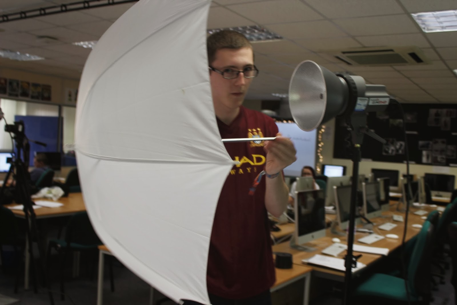
We were observed whilst setting up a temporary photo shoot set.  Here are some pictures to prove that we completed the task.


First of all we needed to set up a back drop stand and make sure it is a decent height and that the backdrop covers up everything.


We then have to put a pole through the backdrop so that it will go onto the top of the stand on either side.


After placing it onto the stand you have to tighten it so that the backdrop doesn't fall whilst you are taking pictures and so it won't injury anybody.


After you have rolled the backdrop out we have to place a clip on either side so that the rest of the backdrop doesn't keep rolling out.


After placing weights down on the backdrop to make is straight and to make sure the ends didn't curl, we had to put to more stands up for the flash which is connected to the camera.


We then put both of the light on top on the stand and then took the lid off the light so that it is ready for use.


We put the plug into the socket and made sure all were tucked away so that nobody will trip over them.  Once the plug is in the socket we then put the AC cord in the back of the light and then test it to make sure it is working before you start shooting.


Lastly we then put on mini umbrella at the end of the light, so that the flash wasn't too bright on the subject .